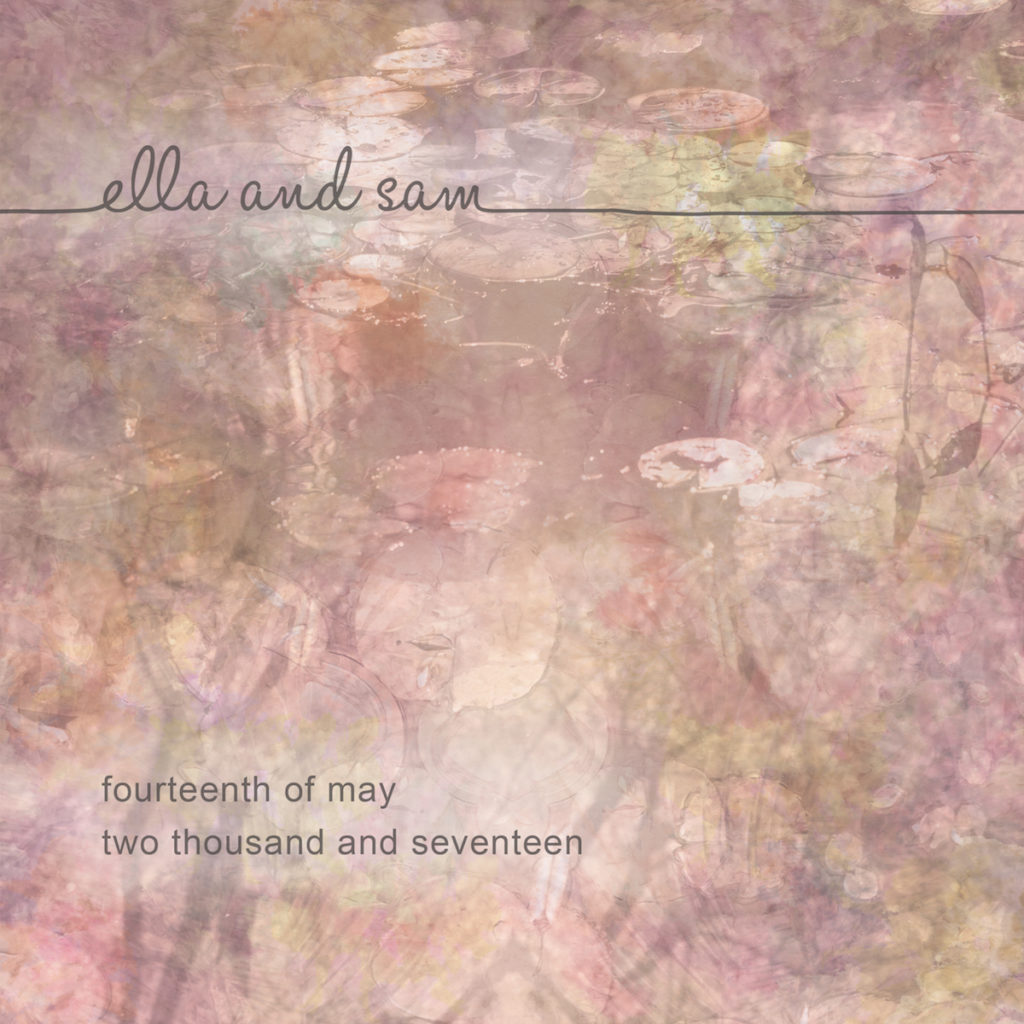
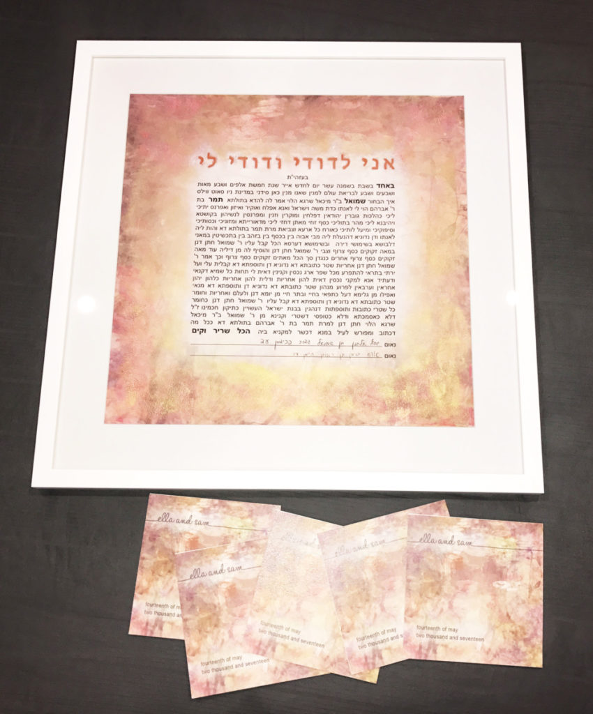
This couple wished to harness the artwork from their Ketubah as the front cover for the Benching cards of Birkat Hamazon (Grace after meals). Here, the “Ella and Sam” scripture was identical to that appear on the invitation.
In this way, the various artefacts from the wedding forever sing in the same visual chorus and harmonise together.
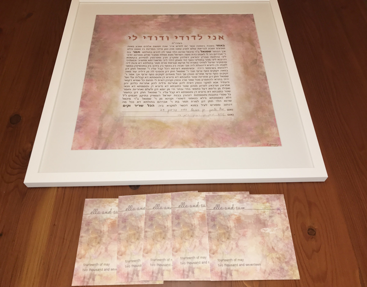
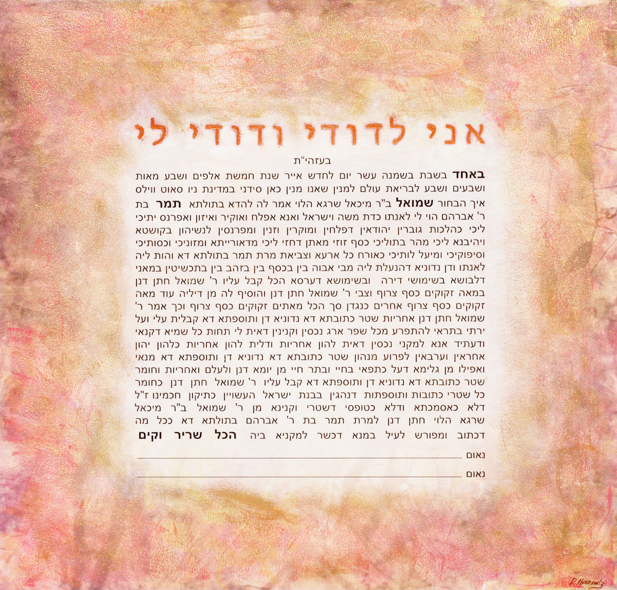
This Ketubah and matching Benching card cover harnesses water colour washed layers, overlaid with textural acrylic applications and metallic dusted pigments which expand over its surface like a floral pink veil. For this Ketubah, the bride wanted it to sing of three visual themes; being square, being pink and being sparkly. The final piece strived to satisfy the criteria of this brief. The benching card in turn followed suite.
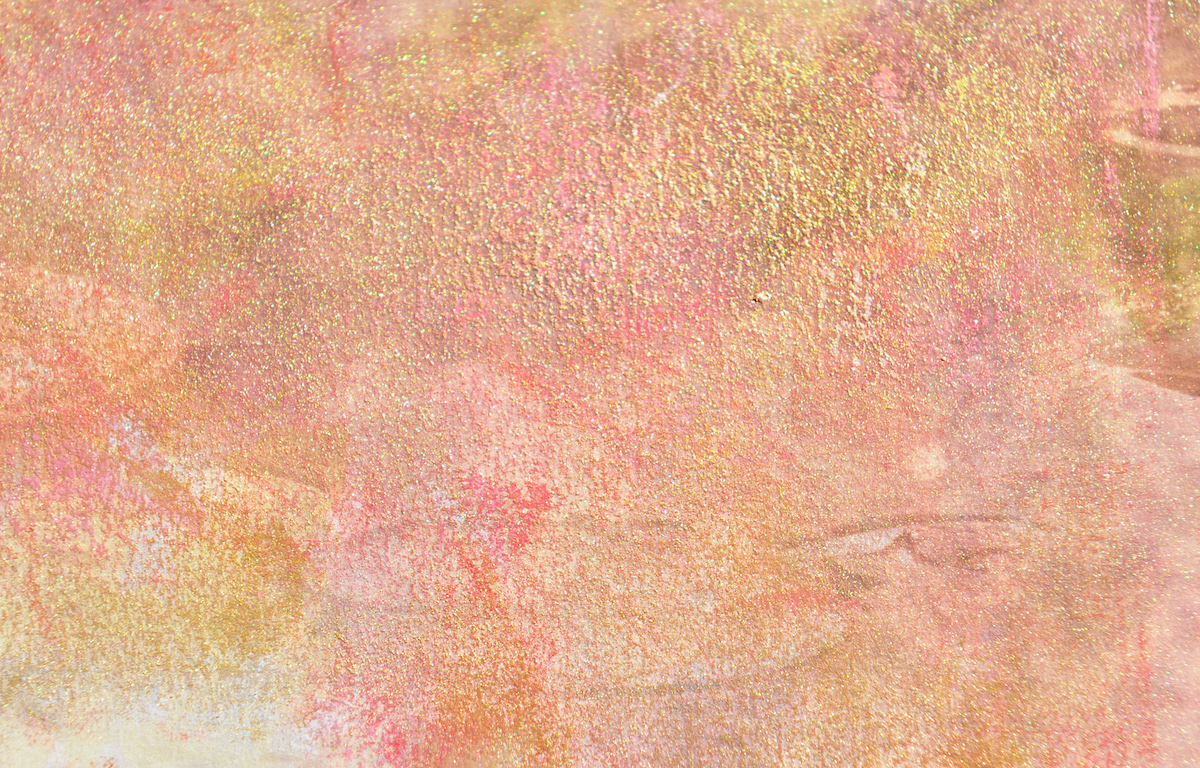
The watercolour stained background is composed of a symphony of dusty pinks, rose pinks, pastel pinks together with peachy oranges, pastel yellows, beiges, whites, soft greys and gentle accents of charcoal.
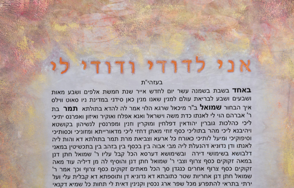
The square pronunciation of both the text and artwork shape yield a sense of symmetry and equilibrium.
